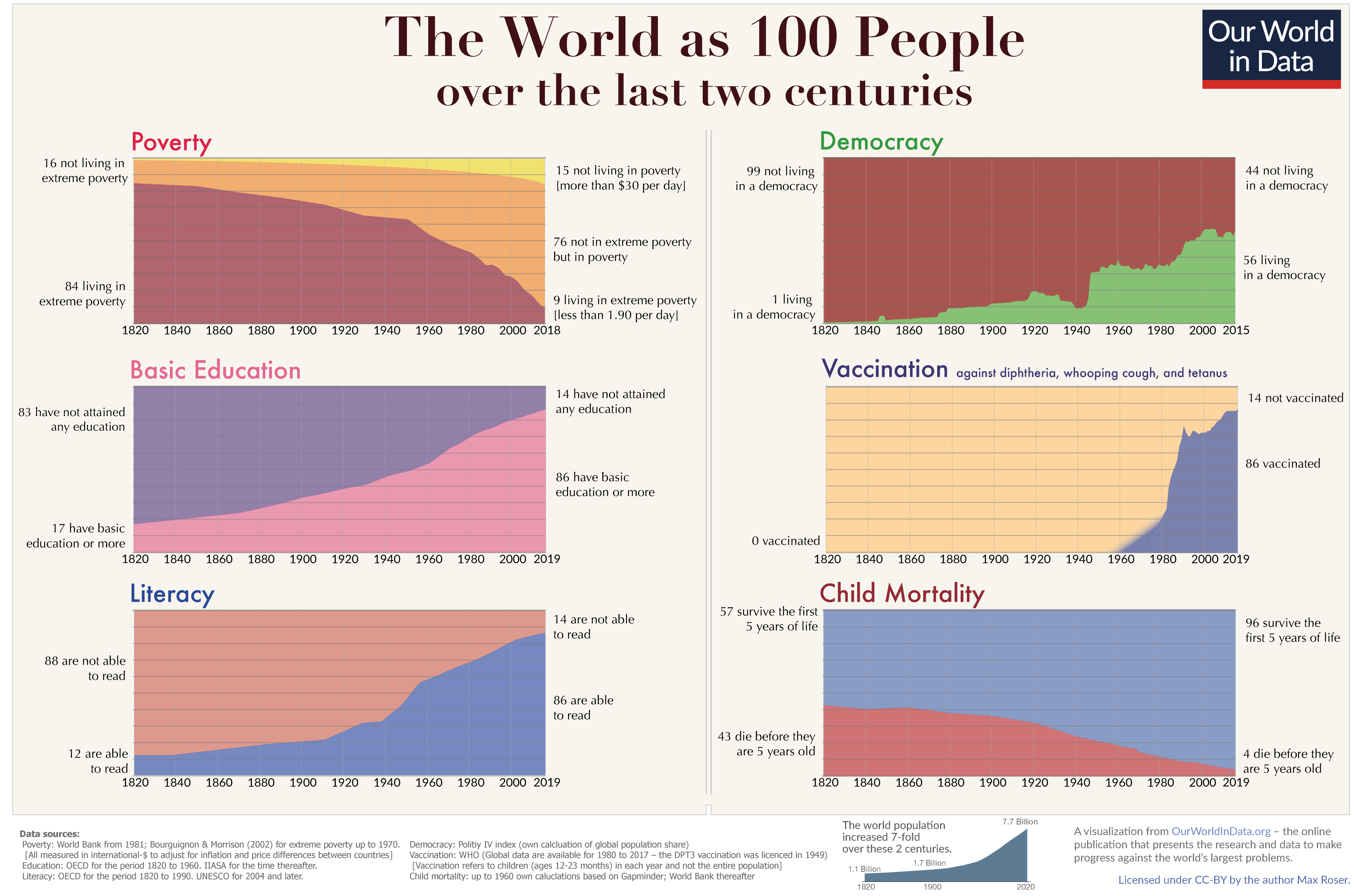
Some days ago, I saw shared on Facebook an essay, Max Roser's "A history of global living conditions in 5 charts" at the Our World in Data project. In this essay, Roser makes the argument--contrary to the zeigeist of 2016--that, in fact, in the longue durée things have been getting decidedly better for people. Extreme poverty and premature mortality have faded, rates of literacy and education have risen, and both living standards and levels of political freedom have increased hugely. (Fertility rates, Roser has noticed, have fallen markedly worldwide as a result of these trends' conjunction.) Towards the end of this, Roser created a chart exploring just how radically things have changed.
The shift has been marked. Back in December 2010, I wrote about the demographic dynamics of the Roman Empire and other pre-modern polities, noting after Vaclav Smil that there are no modern equivalents to the terrible suffering of the past anywhere on our world now. Even central Africa, probably the least developed area of the world, is better off. More, as Roser notes, the dynamics to date are positive: rates of premature mortality and undereducation are falling, for instance.
Why is there unfounded pessimism about the world's future prospects? Roser suggests that the answer can be found in our failure to adequately understand the significance of long-running trends.
One reason why the media focusses on things that go wrong is that the media focusses on single events and single events are often bad – look at the news: plane crashes, terrorism attacks, natural disasters, election outcomes that we are not happy with. Positive developments on the other hand often happen very slowly and never make the headlines in the event-obsessed media.
The result of a media – and education system – that fails to present quantitative information on long-run developments is that the huge majority of people is completely ignorant about global development. Even the decline of global extreme poverty – by any standard one of the most important developments in our lifetime – is only known by a small fraction of the population of the UK (10%) or the US (5%). In both country’s the majority of people think that the share living in extreme poverty has increased. Two thirds in the US even think the share in extreme poverty has ‘almost doubled’. When we are ignorant about global development it is not surprising that few think that the world is getting better.
The only way to tell a history of everyone is to use statistics, only then can we hope to get an overview over the lives of the 22 billion people that lived in the last 200 years. The developments that these statistics reveal transform our global living conditions – slowly but steadily. They are reported in this online publication – Our World in Data – that my team and I have been building over the last years. We see it as a resource to show these long-term developments and thereby complement the information in the news that focus on events.
The difficulty for telling the history of how everyone’s lives changed over the last 200 years is that you cannot pick single stories. Stories about individual people are much more engaging – our minds like these stories – but they cannot be representative for how the world has changed. To achieve a representation of how the world has changed at large you have to tell many, many stories all at once; and that is statistics.
Individual stories matter, but statistical trends like these also merited tracking. Let's try to do them both this coming year, here at Demography Matters and elsewhere.


