As illustration, it's map time.
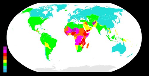
Originally found here, this map ranks the countries of the world according to total fertility rate over 2005-2010.

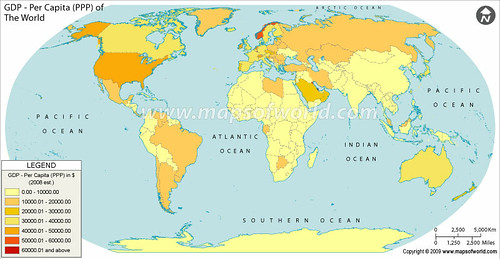
Originally found here, this map ranks the countries of the world by their 2008 GDP per capita at purchasing-power parity.

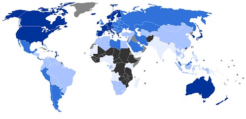
Originally found here, this map ranks the countries of the world according to the United Nations' Human Development Index.

As Kunzig observes in his article, decisions on fertility are product of any number of cultural elements, from the relative autonomy of women to the structure of economics to relationships with the divine. It may almost be clichéd to suggest that human and economic development are contingent on the sorts of the far-reaching of cultural norms that inevitable produce a four-stage--maybe five-stage--demographic transition. An excellent way to help reduce unwanted fertility, I'd argue, would be to help those countries disconnected from the world economy and in desperate need of health and education services for those populations to fill those needs.
As for the impact of the environment, the Global Sociology Blog's author went on to notice, population growth in peripheral countries doesn't have nearly the same effect as overconsumption (more regular consumption also, I'd add) in core and semiperipheral countries. It's not so much the quantity of people as the quality of their consumption that will determine the fate of the natural environment, in other words.


5 comments:
From a cartography perspective, all three maps demonstrate really poor choices of color.
Yes, well.
GDP colors are ok
other maps really = bad taste
GDP colors are ok
Look again. The GDP colors are the worst.
If you are looking to purchase sterling silver jewelry make sure that you have a magnet with you and a good eye. When you do this, you become able to find fake pieces of any type of sterling jewelry.
jerryallentraveljets |
winetourtemecula |
bluestraveleraztec |
wallofdeathworldtour |
tourbystudent |
Post a Comment