Showing posts with label maps. Show all posts

Friday, October 30, 2015

Some thoughts on the 2015 Canadian election (#elxn42)


Last Monday, the long-awaited Canadian federal election finally occurred and produced a rather remarkable shift.


For comparison, below is another Elections Canada map, this one from the 2011 election.


One obvious result of this shift is that the long-form census will almost certainly be restored in time for 2016. A minor election issue, there seems to be time enough to fix things for 2016. Certainly, as explained by the Ottawa Citizen's Jason Fekete, fixing the census is a cost-effective way for the new Liberal government to prove itself to its supporters.

Statistics Canada is quietly waiting for its official marching orders from a new Liberal government to quickly reinstate the mandatory long-form census and have it ready for 2016.

Justin Trudeau’s Liberals have promised to restore the mandatory long-form census that the Conservative government eliminated in 2010 and replaced with a voluntary National Household Survey that critics say has significant holes in its data.

The incoming government has also promised to make Statistics Canada “fully independent,” believing Stephen Harper’s Conservatives meddled with the data collection agency for its own political purposes.

Trudeau’s new Liberal government will be sworn in Nov. 4 and is expected to move almost immediately to restore the census to allow Statistics Canada enough time to have it ready for its rollout in May 2016.

“We will immediately restore the mandatory long-form census, to give communities the information they need to best serve Canadians,” says the Liberal platform.


(I would note, parenthetically, that this year as in 2011, I voted for the NDP candidate in my riding. In 2011, the NDP candidate won; in 2015, the same parliamentarian, incumbent, lost.)

I noted in my post here on the 2011 election that this year's election revealed and crossed some interesting fault lines. The split between Conservative and non-Conservative MPs in the Greater Toronto Area, for instance, mirrored fairly deep splits of class and ethnicity, the better-off downtown voting for non-Conservative candidates and the suburban peripheries voting for Conservative candidates. This year, the Liberals swept the entire Toronto area, and then some.

I also noted that the NDP came from nowhere to become the dominant political party in Québec, even all of French Canada. I speculated that, between its existing English Canadian base and its new dominance in French Canada, the NDP could well be on track to replace the Liberals as one of Canada's two natural parties of government. This did not happen. While the NDP does retain a strong presence in Québec, and likely has potential for recovery now, years after the taboo of a NDP presence in Québec was spectacularly breached, the party is going to take a long time to recover across Canada.

This Tuesday, I put together a collection of links about the election, noting (for instance) the disenchantment of many Canadians--including right-leaning Canadians--with a Conservative government they saw as betraying their interests for its own benefit, the renewal of the connections of newer immigrant groups with Liberals, and so on. All of these things produced what, by any account, is a Liberal landslide, one that took the Liberals from third party to governing majority and even saw the Liberals make inroads into areas of western Canada like Alberta lost since the 1960s.

What will come next? Will the splits of old recur, and how? Follow this blog.
Thursday, January 06, 2011

Some maps and some transitions

The Global Sociology Blog is located on my blogroll at A Bit More Detail, and a regular read with its sharp and acerbic comments on the world as it relates to the social sciences. Yesterday, the author reacted to Robert Kunzig's National Geographic article "7 Billion" and associated video, by observing that "population does not grow homogeneously but largely in the periphery."

As illustration, it's map time.

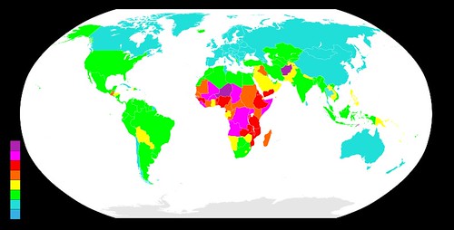
Originally found here, this map ranks the countries of the world according to total fertility rate over 2005-2010.

800px-Countriesbyfertilityrate.svg


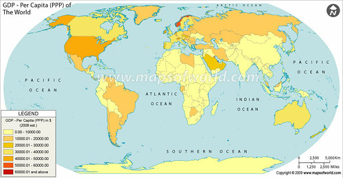
Originally found here, this map ranks the countries of the world by their 2008 GDP per capita at purchasing-power parity.

GDP-per-capita-PPP


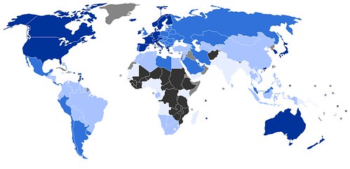
Originally found here, this map ranks the countries of the world according to the United Nations' Human Development Index.

800px-2010_UN_Human_Development_Report_


As Kunzig observes in his article, decisions on fertility are product of any number of cultural elements, from the relative autonomy of women to the structure of economics to relationships with the divine. It may almost be clichéd to suggest that human and economic development are contingent on the sorts of the far-reaching of cultural norms that inevitable produce a four-stage--maybe five-stage--demographic transition. An excellent way to help reduce unwanted fertility, I'd argue, would be to help those countries disconnected from the world economy and in desperate need of health and education services for those populations to fill those needs.

As for the impact of the environment, the Global Sociology Blog's author went on to notice, population growth in peripheral countries doesn't have nearly the same effect as overconsumption (more regular consumption also, I'd add) in core and semiperipheral countries. It's not so much the quantity of people as the quality of their consumption that will determine the fate of the natural environment, in other words.

Thursday, July 15, 2010

Look to Geocurrents, e.g. on Mexico

One blog that I find endlessly fascinating is Geocurrents, a map-driven blog written mainly by Martin Lewis that makes use of maps to illustrate facts of regional differences in economic development, say, or diverging demographic patterns, or zones of shared (or divergent) cultural affinities that literally need illustration.

Two posts that I think our readers will like, given Scott's Mexico-related posts, examine that country. One post ("Misconceptions About Mexico’s Birth Rate") points out not only that Mexico as a whole is well advanced in its demographic transition--the volume of emigration to the United States has little connection to supposedly astronomical current birth rates--but that different Mexican states are at very different points on the transition.

Another ("Regional Economic Disparities and Migration in Mexico") makes the point that Mexico's economic divisions are at least as notable, GDP per capita in its federal units varying widely, comparing at the highest to Slovenia's (Distrito Federal) and at the lowest to Albania's (Chiapas). (Even in that case, it's still much higher than GDP per capita in most of Central America, a region treated in more recent posts.)

Anyway, go, visit, enjoy, comment.